Above are pictures of my complete cd cover. I used photos that I had taken while filming, so the pictures have similar lighting and locations to those used in my video. I also stuck to a colour theme using similar colours to those in my pictures. For example I added in leaves that were similar colours to the ones in the background. I think that this worked really well and the colours worked well together. The colours I used were also reflected from the cd cover I looked at by John Mayer, i took inspiration from the theme and added my own style to it.
Advert-
For the advert I used more photos that I had taken, making sure not to re-use any I had used for my cover. I again placed added leaves over the top and also added some titles and release information.
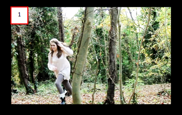
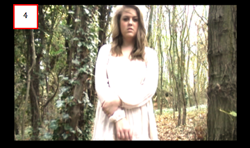
Hello, my names Katherine and this is my music video to the song Saltwater by Chicane. It was released as a single in 1999, reaching #6 position on the UK Singles Chart and becoming a popular dance track in clubs. The music is mainly music based, with few lyrics, but I wanted them to be emphasised. For example to the lyrics ‘Open your eye’, I wanted a literally reference and had a shot of a girl opening her eyes. The theme to my video was to have lots of action, and I took inspiration from videos such as Silence by Delerium and another of chicanes videos, Poppiholla. I wanted to portray a particular message in my video that the girl was lost, searching for a way out. I also wanted it to be quite mysterious as if the viewer themselves were lost. I included point of view shots, so that the audience could put themselves in the girls’ shoes and have that out of control feeling, for example when she is spinning around and things start to go out of focus. Acting on having mysterious elements to my video I wanted the girl in the video to have a flowing dress on to add movement when she ran, but I also wanted there to be a contrast between her and the setting. I filmed in a wooded area, where there was a lot of colour around. This worked to my advantage as it created juxtaposition between the two, as she was dressed nicely and lost in a wood, which makes the viewer wonder how she got there and perhaps what’s she running from. The choice of location was very important as I wanted to frame my shots, so the location that I went with worked well as I had for example trees and fences in the shots so I could do the rule of three. I experimented a lot on Adobe premier Pro, the main program that I used to create the video. I played around with lighting, making shots lighter when needed, especially in the dark wooded area that I filmed in. I liked having strong contrast between the girl and the setting and think that this turned out well as it made her eye-catching and the main focus. I also liked using slow motion in the slower parts of the song, as the overall pace of the song is quick fast. For these fast areas I used jump cuts and thought that these gave a really good effect and the video played along nicely to the music. I used contrast and the use of colour, which I had used for my video on my digipak as well. I took photographs on location when I was filming for the video so the images that I used matched the video in lighting, location and theme. I thought that this worked well as I didn’t want to have photos that had a different theme to the video. For the advert I again used photos that I took on the day, this way all three followed a theme and looked like they belonged together. In conclusion I feel very proud of all three products that I have been able to produce and learn from and feel that they are strong pieces of work.


